Create user journeys that convert
When you're about to start a new web project, you can often jump into thinking about what the information architecture (IA) should be, what the pages will look like or what visuals you want to use too quickly.
These are all essential aspects that make up a site, but when I'm starting a web project, I like to start with the most important part: the customer. The customer is the person the site will be built for, and we want them to have the best experience while using it. If users have a great experience and can complete tasks easily, they are far more likely to convert.
At the start of this project, I created a suite of user personas (see creating user personas post). In this post, I talk about the steps we went through to design flow and how it shed light on aspects of the journey we hadn't initially thought about.
What Is User Flow
“User Flow is the path a user follows through an application. The flow doesn’t have to be linear, it can branch out in a non-linear path. By determining this path you can see possible turns through the route and can optimize the user experience.”
— UX PLANET
The process has two main stages:
Defining the user and business goals for each persona
Outlining the flow of each user persona - Shorthand flow design (there can be more than one flow per persona. e.g. A user who comes to the site from an email Vs a user who enters from PPC ad.)
Defining Goals
Step one: Take the user goals identified when creating your user personas and write each on a separate post-it note. Do the same for the business goals.
While working with the client, I put both sets of goals up on the wall. Everyone could see them, and it helped keep everyone on the same track. For me, having the user goals up on the wall was key. It allowed us continually think “is this flow going to help meet the user needs?”.
Creating The Flow
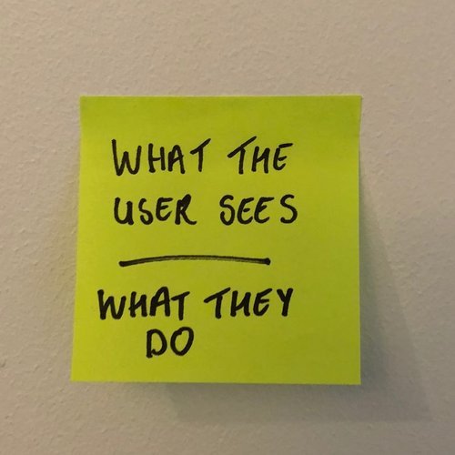
Step two: For each interaction, write what information the user will see and what action they will take underneath it.
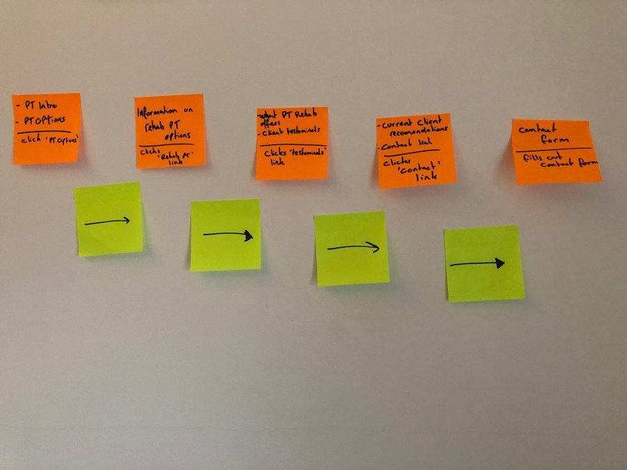
To keep the process fluid, we used a shorthand user flow process that has been used by Ryan Singer at basecamp. The process is simple, you write what the user sees and what action they take for each screen they would see. An example would be “sees information about the service - clicks ‘find out more’” Creating flow like this meant it was quick to create, quick to change and everyone could understand what was happening.
It was at this stage I found the process of having the user at the front of our thinking (and in front of us on the wall) to be hugely beneficial. We knew who the persona was, their goals, and how they got to the site. All of this information meant we could design a flow that catered to that user with their specific goals. We repeated this process for each user persona, and various entry points to the site.
The End Result
At the end of this exercise, we had designed several different flows, for different personas, with varying points of entry to the site. Each user flow detailed the information that should be shown on each page and the action to get to the next step.
Throughout this process, the user goals are always at the forefront and visible to everyone. Going through this exercise was great for thinking about what each user needed at each stage in their journey. It helped define what information should be on each page and what action should be provided to support the flow. It challenged everyone to keep thinking about the user perspective which can create a better user experience.
The next step for this project is to test the journeys. I will create user flows prototypes to see if users can accomplish their goals. Once the results are in, I’ll be tweaking the flows/ prototypes and moving on to designs.
If you want to check out more information on user flows follow the links below, I found them to be useful while working on this project.


